Raha beauty clinic rebrand

Flat Architecture Brand Logo
raha-store-front

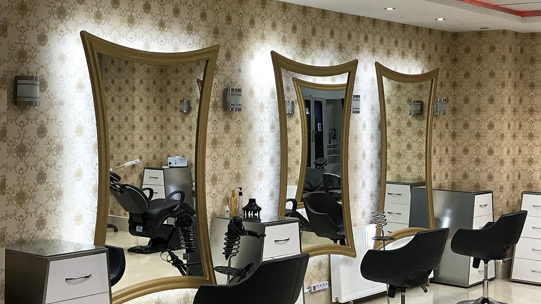
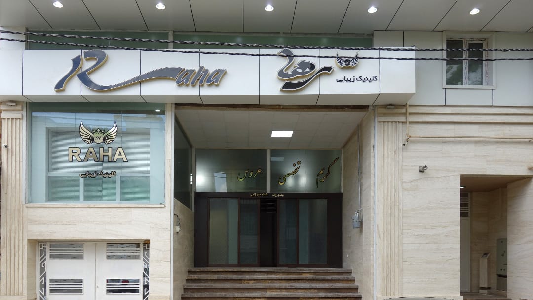
The interior architect/interior designer who designed the space for Raha also offered to create the brand identity design and signs. Unfortunatley, their design did not capture the brand identity. The above image displays what the store looked like.  

raha-original-brand

The project started initially with designing some flyers. During a tour to understand what the brand is about, it became clear that brand logo was disconnected form the business.

raha-rebranded-logo-design
RAHA Beauty Clinic logo design

The logo recomposes the brand identity into a fashionable stylish look. The circle symbolizes completion – Raha’s complete set of Beauty solutions. The circle is transformed into a brush stroke to emphasize the artistic and creative touch of Raha’s beauty solutions.  The crown is a symbolic reflection of a time and establishment.

raha-store-front
raha storefront redesign
#

Your may also like…

i am cree branding

i am cree branding

 When we searched for a brand name and brand icon, we wanted the design to mean something, we wanted to create impact....

read more

Why work with us?

To impact, change, engage, inspire and design a better experience.

Isn’t that worth striving for?
Isn’t that worth dying investing for?