
When we searched for a brand name and brand icon, we wanted the design to mean something, we wanted to create impact. We needed to understand who we are designing for, their story and history, their struggle, and what they are hoping to achieve. It was through these that we developed enough empathy and compassion to be in a position where we could claim the right to design.
- Brand Strategy 100%
- Brand Identity 100%
- Web Design 100%
The Chapleau Cree First Nation Community Trust contacted the wow studio to design a brand new website and do the complete branding. The website’s main activity is to post “Request For Proposals” (RFPs) to its community. While the Trust is managing funds, its focus is on creating positive impact in the community it serves. This focus is inspired by their mission statement.
Mission Statement:
“…to preserve and promote the health and wellbeing of the Members of the First Nation and to preserve and promote the cultural heritage and sustainability of the First Nation, both for those Resident On-Reserve and for those Resident Off-Reserve.”
From the affinity diagram and design process the design direction became further clear. We highlighted two elements above others: identity and future. And so the brand name and brand icon were built on these two concepts.
The brand name “I am Cree” which also sounds like a tagline is founded on the grounds and vision of the Chapleau Cree First Nation Community Trust. It pays tribute to the identity and origin of the Chapleau Cree First Nation and hopes to inspire others.
The brand icon, a monogram formed from the letters Cree embodies a child playing to be an eagle – brave and strong – with the eagle feathers and wings spread out. We used a child as a source of inspiration to represent, imagination, hope, future, change, and freedom. Children are the future of every family, community, tribe, and nation. Children are also kind, friendly, gentle, and curious spirits full of imagination. And as Albert Einstein said: “… imagination embraces the entire world, stimulating progress, giving birth to evolution.”


Culturally aware design
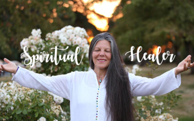
Throughout the website, various cultural elements are implemented to create engagement. There was an opportunity to take photos and we thought as part of self-empowerment it would be ideal to have a photographer from the First Nation community take the photos. The client connected to a photographer, Kari Luhtasaari, in his network and arranged a photo shoot at an upcoming pow-wow event.

photographer: Kari Luhtasaari
The contact page became a place to celebrate Cree culture and create further user engagement. The selection of photos of cree individuals loads randomly on the page when a user goes to the contact page. These photos show and celebrate the diverse vibrant first nation Chapleau cree people.

The people from the land
First Nation people have a strong spiritual, physical, social and cultural connection to the land. It is a part of their identity. We wanted to pay tribute to that by using topographic pattern in the design of some of the banners on the website.

Fun fact
Grammarly’s ai system tries to auto-correct what it does not have in its vocabulary and suggests an alternative word for cree = free – isn’t that cool!