Client: flat architecture | Canada
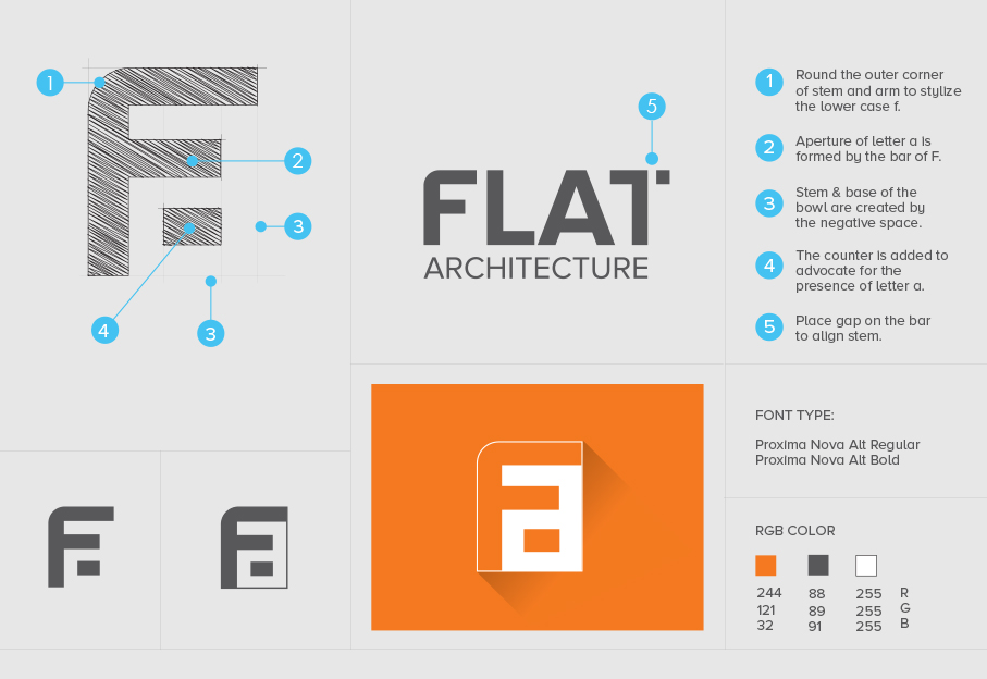
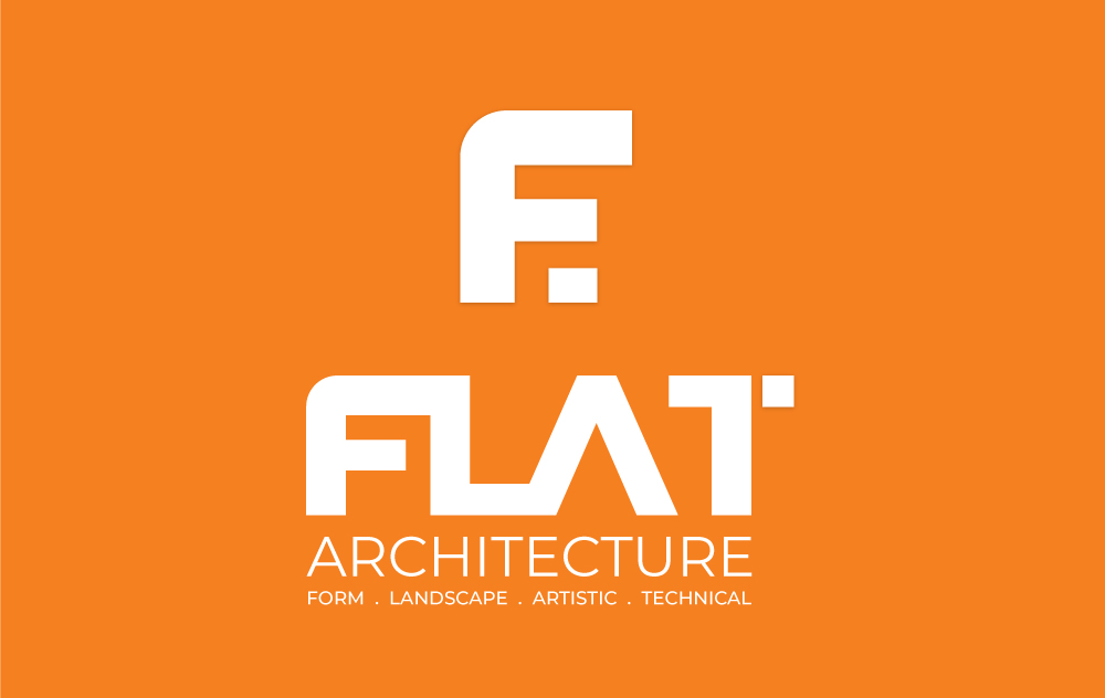
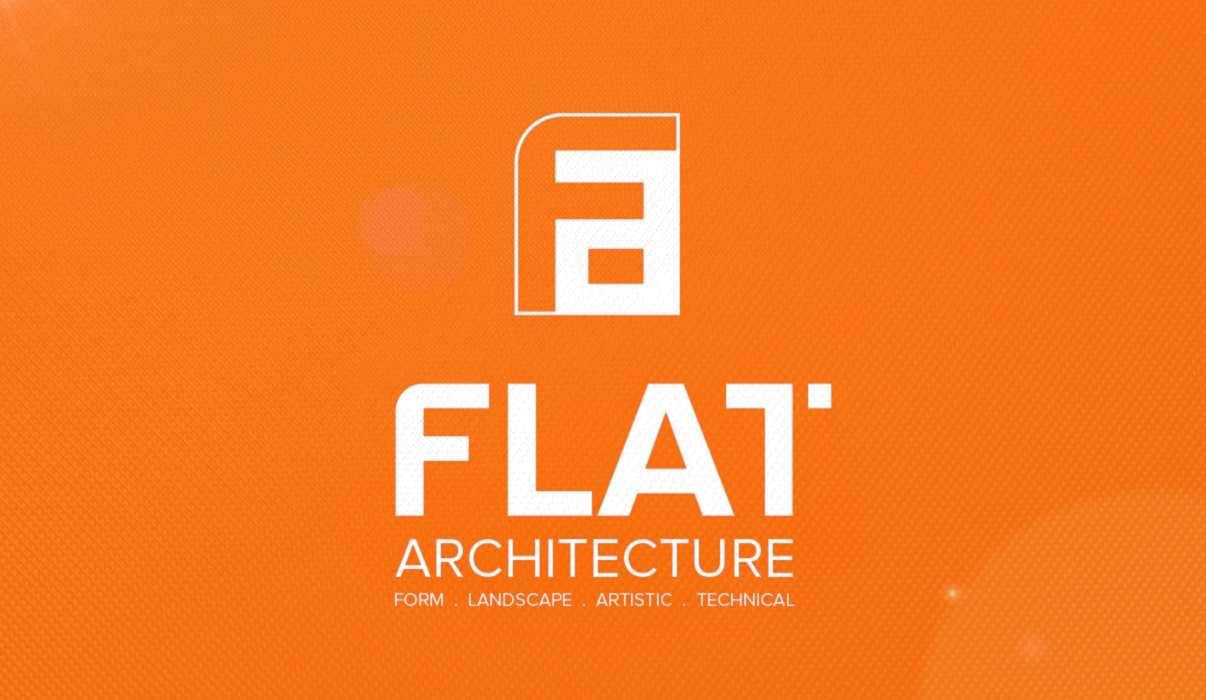
Proxima Nova Bold and Regular created a flat type style, with clean lines – even strokes. The arms of the letters F and T are stylized. The lowercase letter “a” does not exist within the Proxima Nova font family. It is born out of the negative space around the face of the letter “F” which advocates the brand identity of emergence – “flat style” and “architecture”.

“At our agency, client collaboration is integral to our design process. We highly value our clients’ input, recognizing that some prefer to provide detailed recommendations while others entrust our expertise. Regardless of the approach, we ensure our clients have a range of options to consider. While we respect and prioritize their vision, there are instances where our professional opinion may differ. Ultimately, however, the client’s satisfaction remains paramount. With that said, below is our envisioned concept for the brand logo, reflective of our expertise and understanding of the project objectives.”
In this design, we deliberately utilize the interplay of negative space to achieve an asymmetric balance. This technique not only adds visual interest but also prompts a sense of delight as viewers engage in discovery.


