
“We are not physical beings having a spiritual experience; we are spiritual beings having a physical experience.”
―
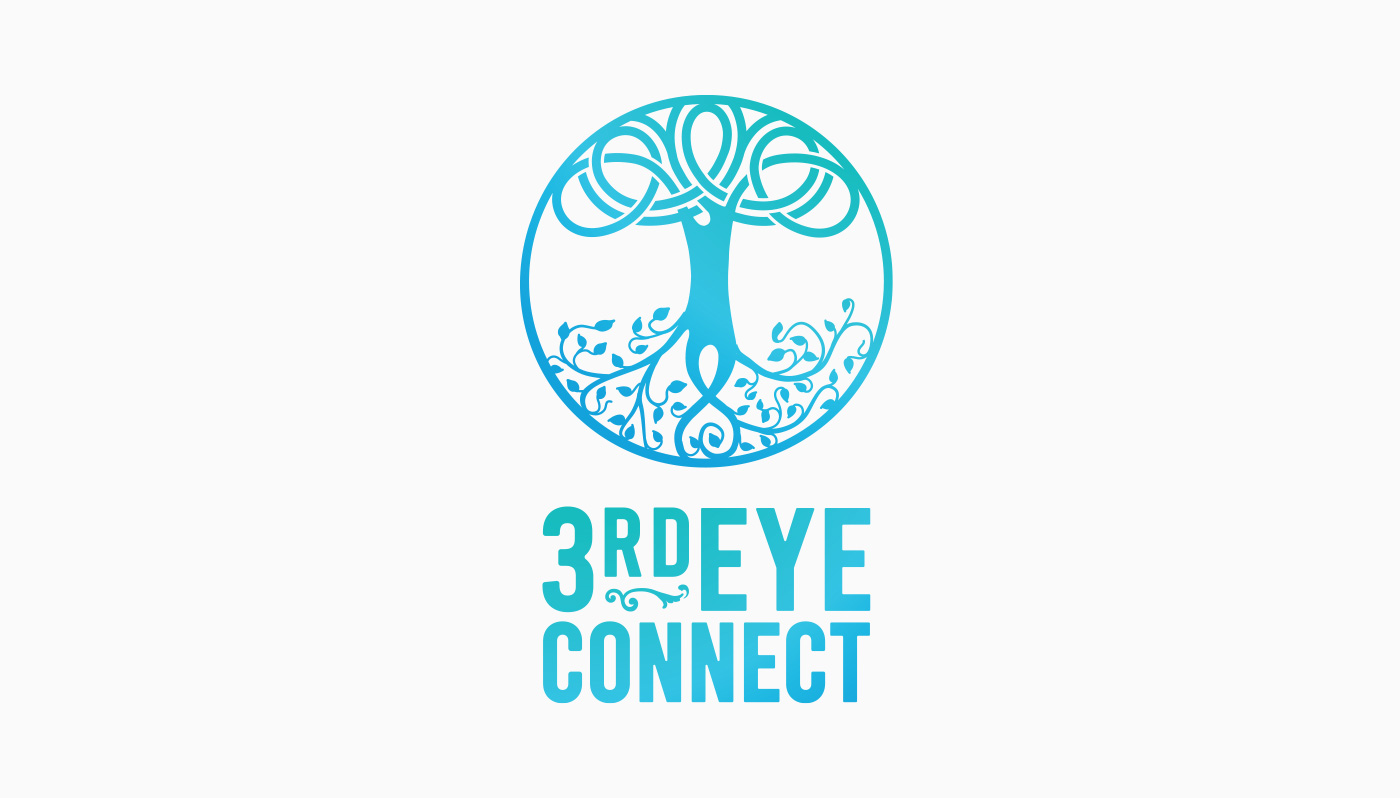
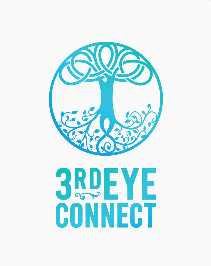
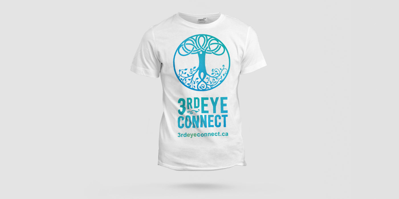
Rickie had a vision of seeing a tree upside down with its roots coming from the sky. The tree is considered to represent life and wisdom. The circle represents wholeness, the self, the infinite, eternity, and timelessness. The turquoise colour works psychologically to create an emotional connection to healing and spirituality.
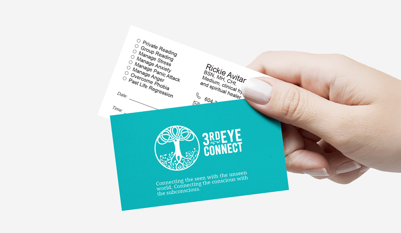
As Rickie’s business grew from hypnosis to medium. 3rdeyehypnosis was rebranded to 3rdeyeconnect. Like “connecting the seen and the unseen world, connecting the conscious and the unconscious world”. And while the new branding colour, logo, and type were well received by Rickie’s clients, over the next two years, Rickie’s business grew more through face-to-face interaction, online workshops and group events. And other networking professionals who hosted Rickie on their website did not advertise 3rdeyeconnect.ca but simply Rickie Avitan. So Rickie’s brand as a person outgrew her brand as a company (3rdeyeconnect).
While with a bit of creativity and marketing strategy the gap could have been closed, in mid-2021 another consulting company took over the project and rebranded 3rdEyeConnect.ca to RickieAvitanPsychicMedium.ca
We learned a lot in this Journey. 🙂

Client: 3rd Eye Connect | Canada