

When we look at web design, navigation menus are very useful in that they are meant to organize information into groups and categories and guide user flow. And while the choice of displaying navigation on small portable devices defaults these days primarily to the hamburger menu, for desktops there are many options. From a single menu to the primary and secondary menu to the side menu, to the hamburger menu. Let’s explore and find out what makes sense.
Why is a good navigation menu important to the overall experience?
Our brain makes more sense of complex data and information when it is sorted, grouped, or categorized. So, it is important to organize information in a logical manner. And to do that you have to understand what users are looking for, how to display it in a logical way so it makes sense, and how to keep a balance of information and aesthetics through design. All that is part of a good user experience design. On the flip side when you design awkward navigation, the users get confused and lose trust. Bad navigation also impacts conversion.
Hamburger Menu
The hamburger menu was originally designed for mobile devices such as smartphones. With the use of smartphones and the internet, the access of websites required Navigation menus to be displayed in a more functional way. The hamburger menu was a user interface design solution to list navigation without cluttering too much space. And the trend of a minimalistic approach grew with flat design and later carried over to desktop view.
The icon was originally designed by Norm Cox as part of the user interface for the Xerox Star, introduced in 1981; it saw a resurgence starting in 2009 stemming from the limited screen area available to mobile apps. Cox described the icon’s creation, saying “Its graphic design was meant to be very “road sign” simple, functionally memorable, and mimic the look of the resulting displayed menu list. With so few pixels to work with, it had to be very distinct, yet simple.
Hamburger menu on desktop
When it comes to desktops where the screen size is wider, what benefit would the hamburger menu serve?
Around 2016 the Nielsen Norman Group conducted a study (https://www.nngroup.com/articles/hamburger-menus/) and concluded among other things that the use of a hamburger menu on a desktop reduces discoverability by close to 50 percent. So, it takes more time for a user to find information on a “Hidden Navigation” such as the hamburger menu. The article recommends for desktop the following:
- Do not use hidden navigation (such as hamburger icons) in desktop user interfaces.
- Instead display the top-level navigation options, usually across the top of the page or down the left side.
But when you are dealing with a large amount of information and many categories you will be challenged to improvise.
How IMB decides to display navigation for desktop
IMB has in this case decided to display both the hamburger menu and the top-level menu. So, users have two ways to access the content on a desktop. I personally found the duplication confusing because you assume that you are looking at a different type of information. It took me a while before I realized that I was mistaken and they both displayed the same information. The only logical question to ask here is “What madness drove the designers at IBM to implement this?”
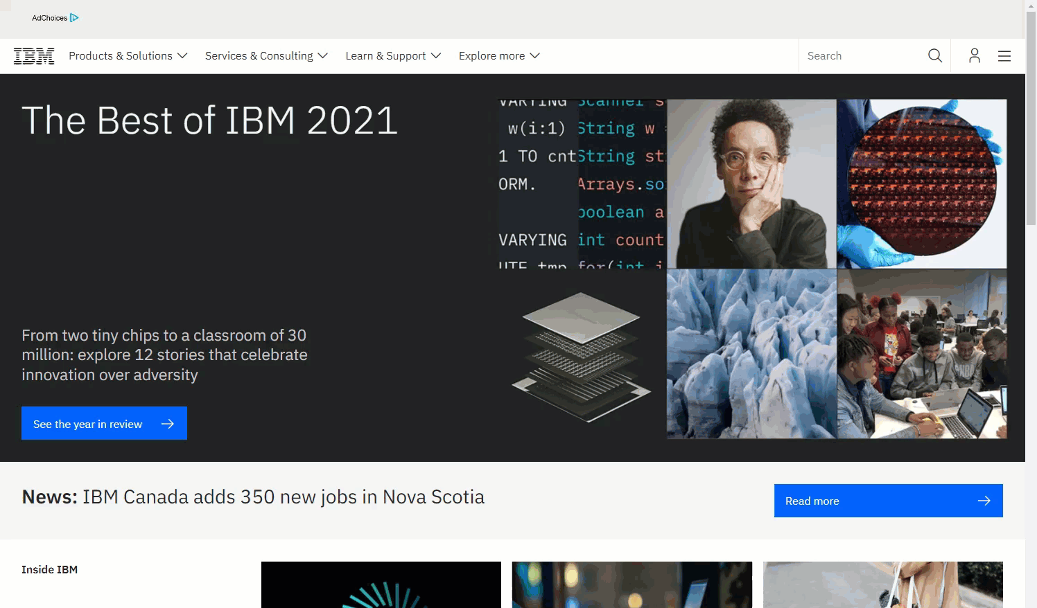
(screen capture 19 JAN 2022 – IBM.com)
Here is how YouTube deals with displaying information:
Google uses the hamburger menu, as well as a bunch of other icons. And among them is also the 3×3 app menu which is also used in Gmail and Facebook. The icon requires no description, and it communicates a set/collection/list of items.

Would it make sense if these icons were replaced with words? Probably not. These are good icons that easily be interpreted to what their function is. Icons bring balance to text heavy interface and stand out.
Hamburger menu and Disorientation
I must admit, back in 2017, I found the transition of a hamburger menu on the desktop very impactful and artistic. But functionally the flow of navigation felt a bit confusing and disruptive. It was difficult to orient myself. I guess the navigation went against the way I was wired to think. But somewhere along I lost that view. And in February 2021, to solve a different problem, we strategized to change the navigation at the wow studio to a hamburger menu. What was the reason?
Interestingly we intentionally did it to prevent people from quickly accessing and seeing the information. Why? Because at the time we did not have much to display we did not want the experience to be short. In addition, the hamburger menu was a stylization to show boldness and illustrate creativity. The credit for the design of this navigation goes to the Elegant theme team and this blog post (How to Build a Stagger-Animated Hamburger Menu with Divi & Anime.js | Elegant Themes Blog)
Why ditch the hamburger menu for the desktop?
- The main problem was the slow load time.
- The aesthetics on mobile was not good.
- It lacked overview – that sense of “where the f**k am I?”
Now that we have a collection of projects under our portfolio, we feel that we don’t have to prolong the search for information. And as the site content is growing it will be all about clarity and quick access to information.
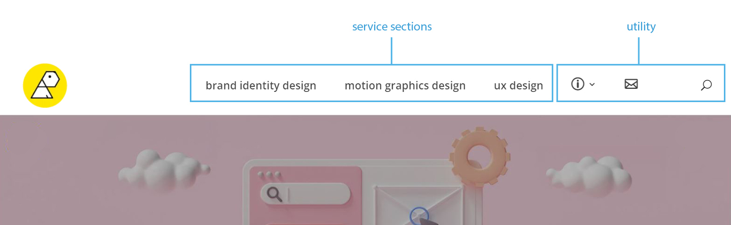
Our new navigation displays the 3 services sections clearly and in contrast the utility items such as our story, our blog, contact us, and search are presented as icons. And here the category is highlighted so you know where you are. Furthermore, the navigation is fixed to display on top as you scroll through the content.

In Summary:
The ideal navigation menu depends on context. Navigation menus can always change. The design depends on how much content you have, what type of content you have, and what you are trying to achieve strategically. If our service sections would grow from 3 to 4 or 5 sections, we would probably change to a dropdown menu with the top tier tabled “Our Services”. The best way to map navigation menus is to use site maps and information architecture. For more visit to our post ( Information Architecture – a building block for good UX).