At The Wow Studio, we believe in the power of design to reflect values, inspire emotion, and build trust. In that spirit, we respectfully submitted a proposal to revitalize the lettermark (or monogram) in a way that preserves the Liberal’s legacy while embracing a fresh, unifying visual direction under Prime Minister Mark Carney’s leadership. Furthermore, we take a cultural approach to branding by extending the visual identity into meaningful merchandise, designed not just to promote, but to inspire connection, pride, and everyday wearability.
The Design Challenge
The existing lettermark uses a side-by-side arrangement of the “L” and the maple leaf. While recognizable, this design often feels disconnected. The rigid vertical form of the L leaves the leaf “floating” without cohesion, creating visual tension.
Merchandise that simply stamps the existing lettermark onto products often lacks emotional resonance—it functions more as labeling than storytelling, missing the opportunity to inspire pride, engagement, and identity.
This disconnect subtly weakens the powerful values the Liberal Party represents: unity, purpose, and inclusivity.
Existing Design
- Layout: “L” and maple leaf placed side by side.
- Visual Effect: The elements feel separate, with little integration.
- Limitation: Doesn’t reflect the unity or strength that defines a new era of leadership.
- Symbolism: A leaf freely floating in the air is unattached, ungrounded, uncontrolled
Design Evolution
We’ve developed three proposed design refinements that resolve this visual tension and enhance the brand’s symbolic clarity, while remaining true to the party’s core identity.
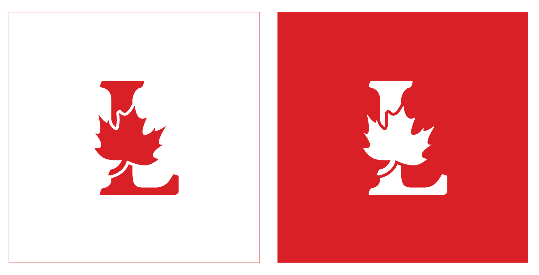
Proposal 1:
The Leaf Says It All
Less is more. What stands out in the lettermark is not the L. It’s not even the L and the leaf together. It’s the leaf — the iconic symbol that stirs recognition, pride, and identity. That’s where the emotional power lives, and where visual clarity must begin. So let’s demonstrate the aesthetics of it.
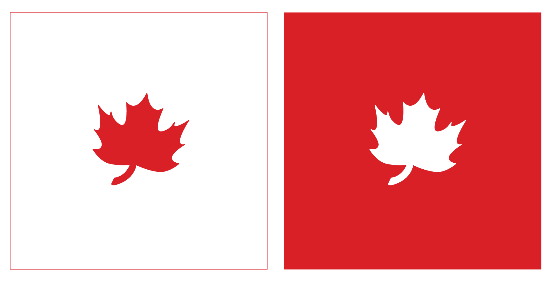

While the maple leaf alone is a powerful and emotionally charged national symbol, it’s also widely used — from Air Canada to the Toronto Maple Leafs, and even the NDP. Each has adopted its own stylized interpretation of the leaf, creating a landscape where the symbol, though iconic, risks becoming visually diluted.
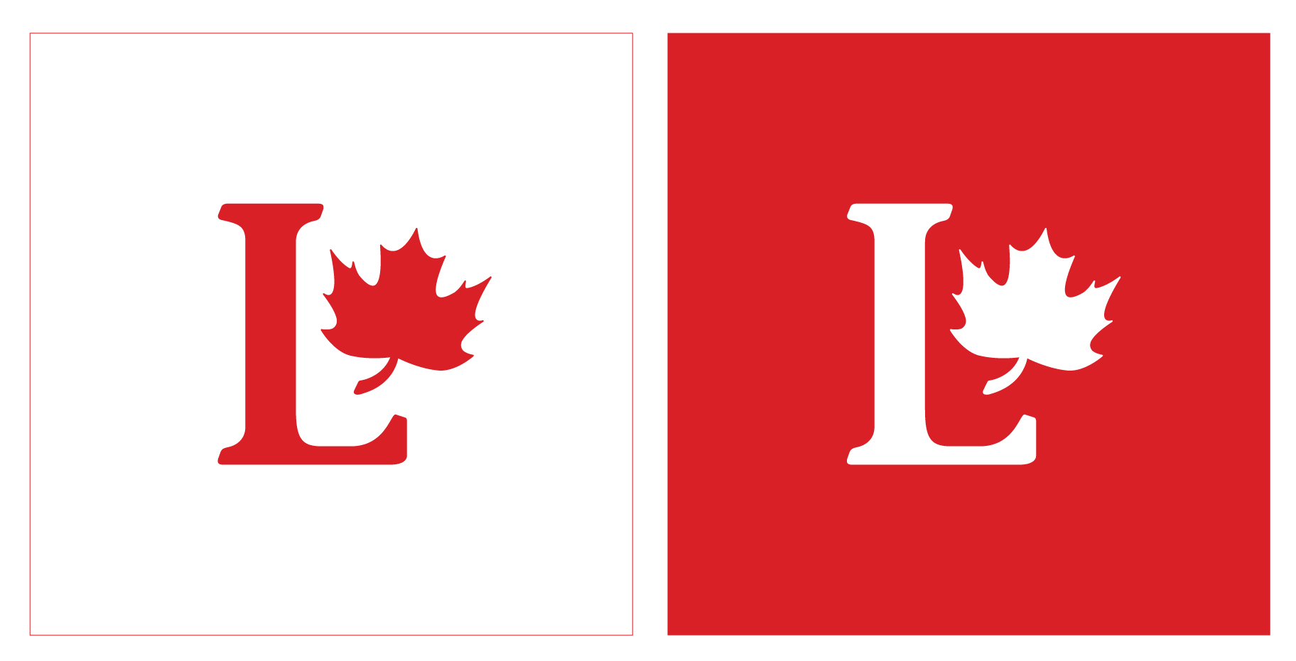
Proposal 2: Refined Lettermark – Unity of Leaf and Letter
- Description: The maple leaf rests gently over the heart of the L — balanced and still slightly tilted.
- Visual Effect: This placement evokes the spirit of a crown, not in formality, but in symbolism.
- symbolism: A quiet emblem of leadership, humility, and unity. It reflects the grounded
strength of a party stepping into a new chapter with confidence and purpose.
- Message: Represents growth, unity, and progress under a new leader.
Proposal 3: Refined Lettermark Within a Circle
- Description: The Proposal 1 Lettermark is enclosed within a ring.
- Visual Effect: The circle completes the design, adding balance and clarity.
- Symbolism:
- Unity and Inclusion — the circle represents people coming together. A Canada bound by shared purpose.
- Indigenous Worldview — in many Indigenous teachings, the circle stands for community, balance, and life cycles.
- Modern Emblem — the enclosed mark feels like a badge of leadership, resilience, and national identity.

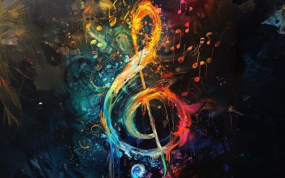
When it comes to merchandise…
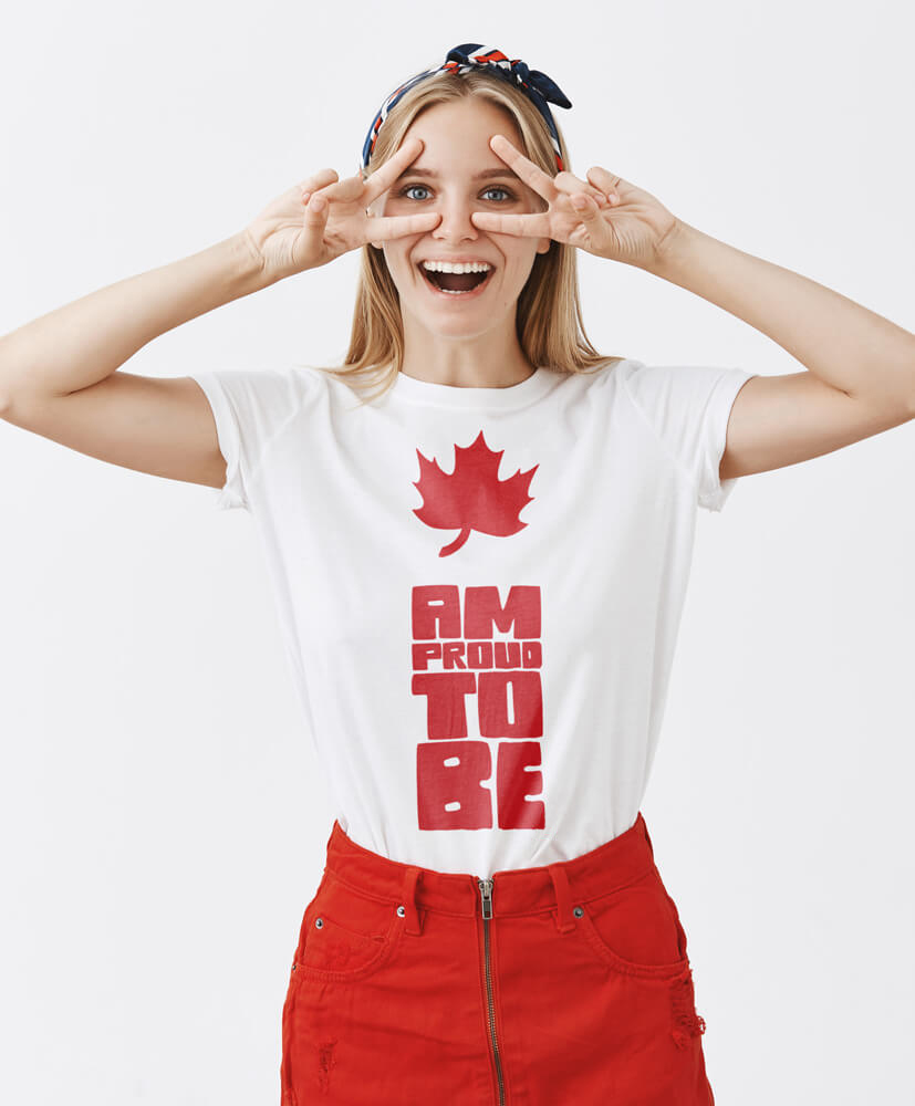
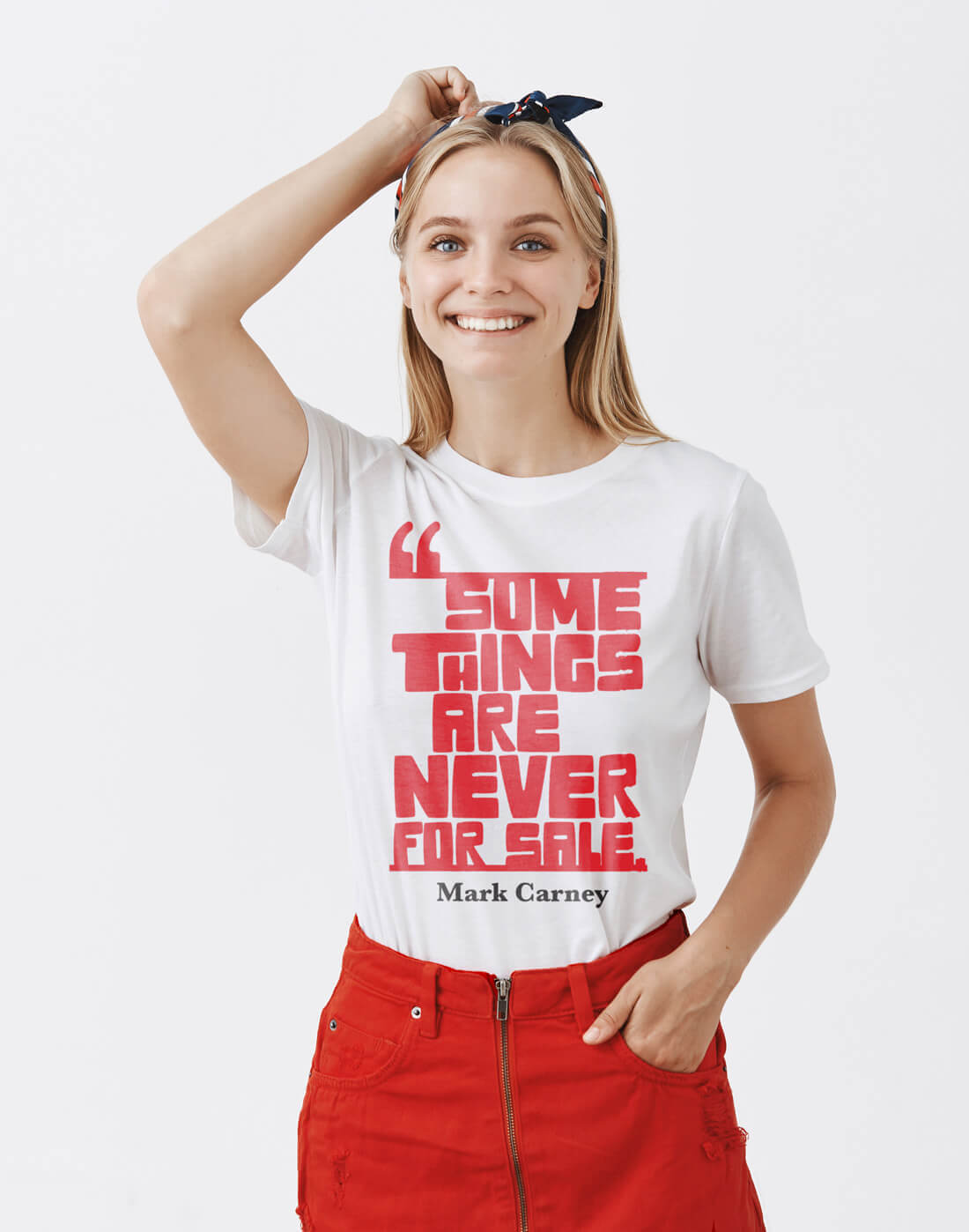
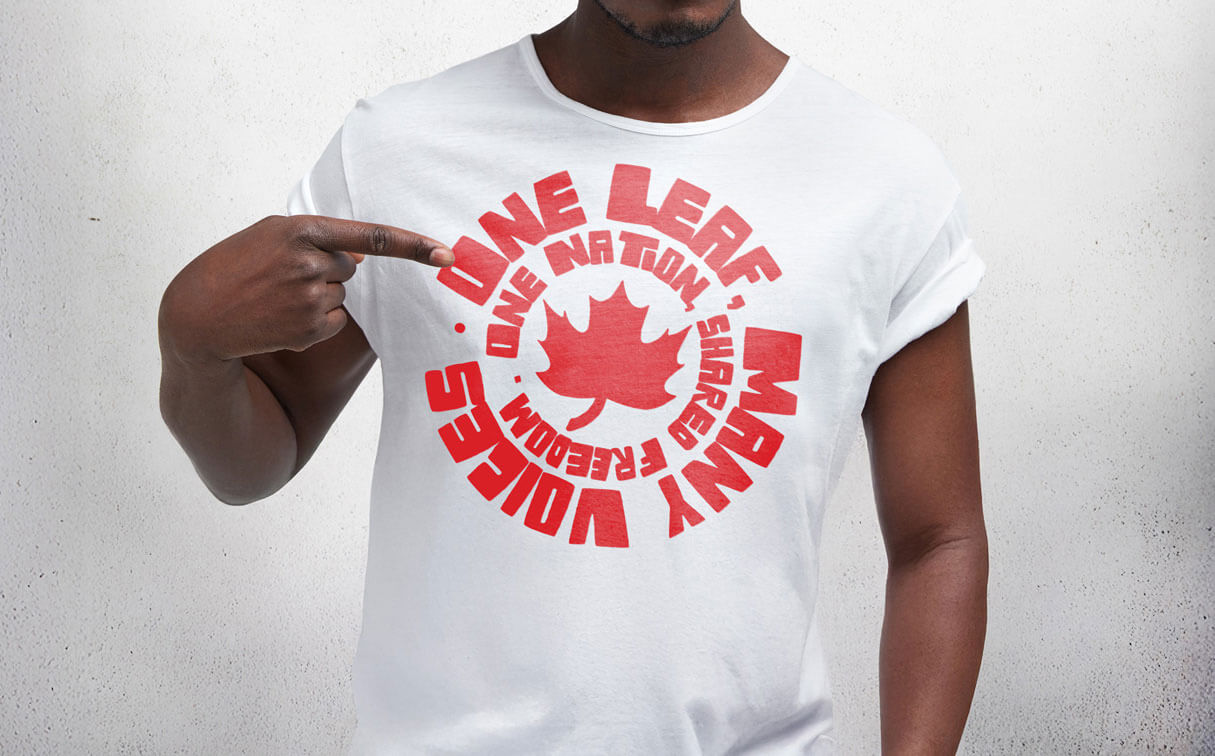
When it comes to merchandise for government entities, there’s often a default assumption that slapping the organization’s logo on a product instantly adds value. While there is indeed a segment of people who appreciate having the logo on a shirt or water bottle—whether for brand pride, recognition, or uniformity—this approach overlooks a significant opportunity: building culture.
Great merch does more than promote a brand; it tells a story, sparks conversation, and builds community. Whether it’s a T-shirt expressing a deeper belief in shared freedom and national unity or challenging us to rethink what truly holds value, meaningful designs connect with people. People will wear these items with pride, not just because they look good but because they stand for something.
Here are a few designs we crafted at The Wow Studio:
Conclusion
This revitalization is more than a cosmetic change — it’s a visual declaration of renewal. This proposed mark better captures the spirit of unity, leadership, and optimism that Canadians feel at this pivotal moment.
The maple leaf has always been a powerful symbol — never ornamental. But in its previous position, floating over the arm of the L, it felt somewhat detached, like a gesture rather than a conviction. By dropping the L we focus on the essential of the brand or by placing the leaf at the center of the L, we bring purpose to the form. It becomes anchored — integrated — much like the leadership of Mr. Carney himself: measured, grounded, and intentional.
This isn’t about making something new for the sake of change. It’s about refining the familiar to reflect the calm strength and principled presence of a leader who didn’t come to make a name, but to serve. Like him, the design takes only the space and time required — no more, no less.