
In the ever-evolving world of design, staying ahead of trends and continuously innovating is crucial. At the Wow Studio, we thrive on pushing the boundaries of creativity. Recently, we recognized an opportunity to redesign the logo of ADP (Always Designing for People), a global leader in human capital management. Though we have yet to receive feedback on our “ADP Logo Redesign Proposal: Enhancing the Brand Identity for the Future”, we are proud of our work and eager to share our vision with you.
The Inspiration Behind the Redesign
ADP is renowned for its innovative solutions and its commitment to responding to evolving workforce needs through user-centred design. There is now an exciting opportunity to further enhance ADP’s brand identity with a refreshed logo that embodies this dynamic spirit.
This refreshed logo will:
1. Embody “Always Designing for People”
2. Advocate for Innovation & Creativity.
3. Invite Playfulness into the Organization
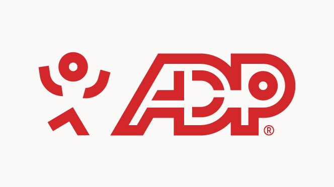
Current logo
“The ADP logo unifies our brand and tells the world who we are. With its solid letters, modern face, and forward orientation, it suggests dependability, advanced methodology, and progress.” – (ADP logo Guideliens, 2024)
Next, we can look at how we can enhance this.
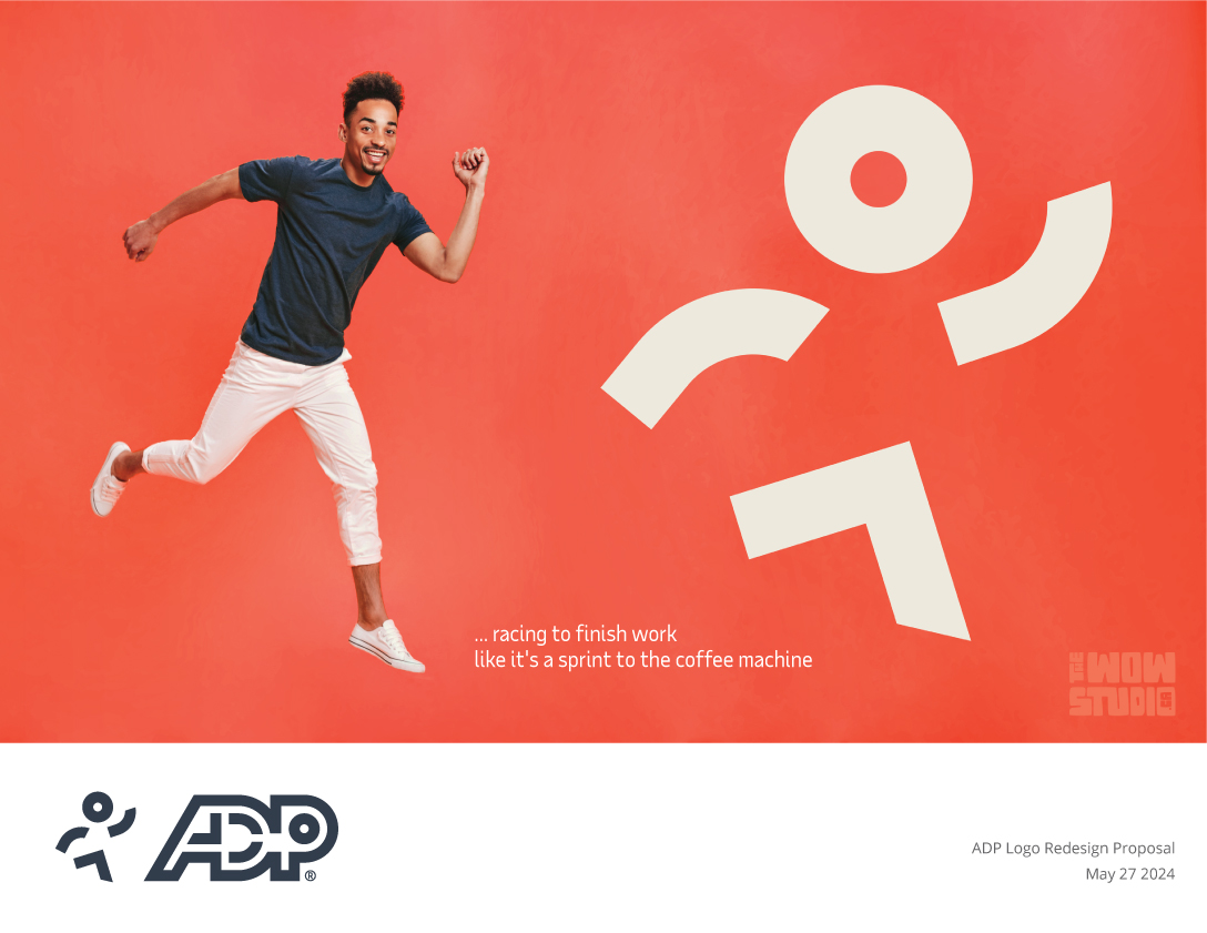
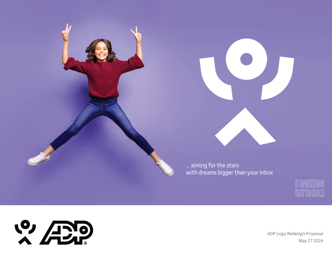
Proposed redesign
Maintaining the core elements of the ADP logo preserves brand recognition and trust, while subtle enhancement elevates the experience. Our redesigned dynamic and character-infused logotype is as forward-thinking and adaptable as the solutions ADP provides symbolizing flexibility, creativity, and progress. The design aligns with the brand’s personality traits such as being innovative, people-centric, empathetic, supportive, trustworthy, reliable, engaging, and conversational. This helps further in building a distinct brand identity.
Clarity and Universality: The simple human figure ensures the icon is easily understood by a broad audience and feels user-friendly.
Relatability: A human figure personifies the brand, making it relatable.
Empathy and Warmth: A character in the logo can evoke feelings of warmth and friendliness, making the brand appear more caring and empathetic.
Trust and Comfort: A familiar symbol can evoke a sense of trust and comfort and thus invite engagement.
Narrative Potential: The character provides a unique narrative voice for the brand, enhancing storytelling across various communications.
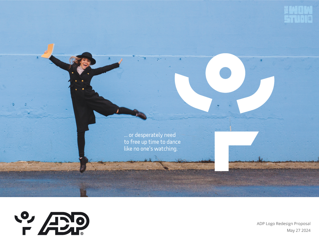
Transformability of the icon

Why This Redesign Matters
Given that a logo is a crucial part of a company’s identity, our redesign aims to close the gap between the brand logo and the brand culture and with it advocate that ADP is not only a leader in human capital management but also a forward-thinking, innovative force in the industry.
Conclusion
While our redesign proposal is still awaiting a response, we believe it represents a significant step forward in brand evolution. We are excited to share our vision with the world and look forward to potential opportunities for collaboration.
Thank you for joining us on this creative journey. We hope our work inspires you as much as it inspires us.