
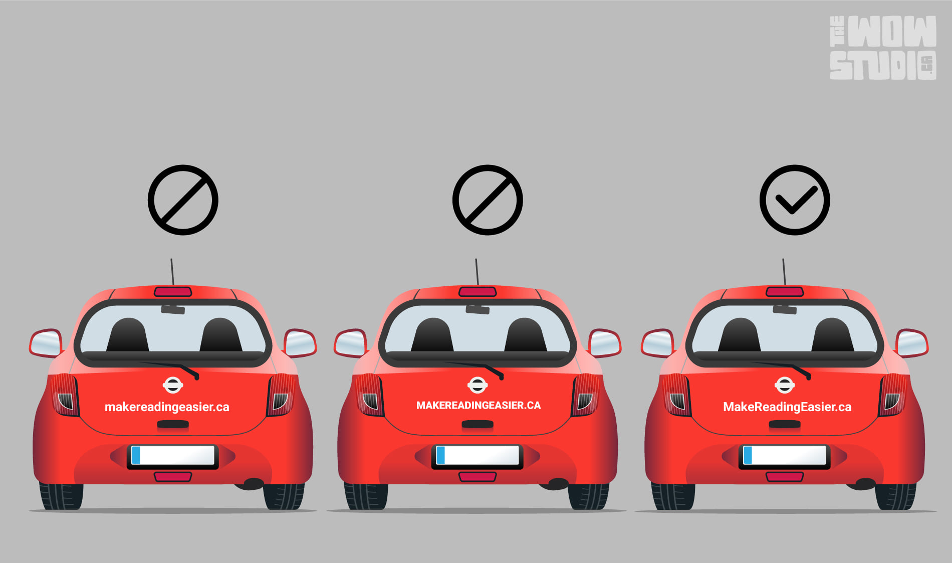
In the world of mobile advertising, it’s common to spot company URLs proudly displayed on vehicles. However, a significant number of these advertisements miss the mark, especially when the URL comprises more than one word. In this post, we’ll explore three methods for displaying URLs, and we’ll guide you toward the most effective approach.
While capitalizing every word might appear visually impactful, it falls short in readability. Mere visibility doesn’t guarantee legibility, and this holds true even in professional and academic settings where an all-caps approach is generally discouraged. For clarity and ease of comprehension, the recommended practice is to use a standard sentence case or title case.
Complicating matters, URLs with multiple words lack spacing, making it challenging to discern where one-word ends and another begins—particularly problematic when potential viewers have only a fleeting glance. The ultimate goal is to convey your message swiftly and effortlessly. If your URL comprises more than one word, opt for title casing (capitalizing the initial letter of each word) to facilitate quick understanding.
By adhering to these practices, you not only enhance readability but also maximize the return on your investment. Ensure that your message is not just seen but effortlessly absorbed by your audience.