

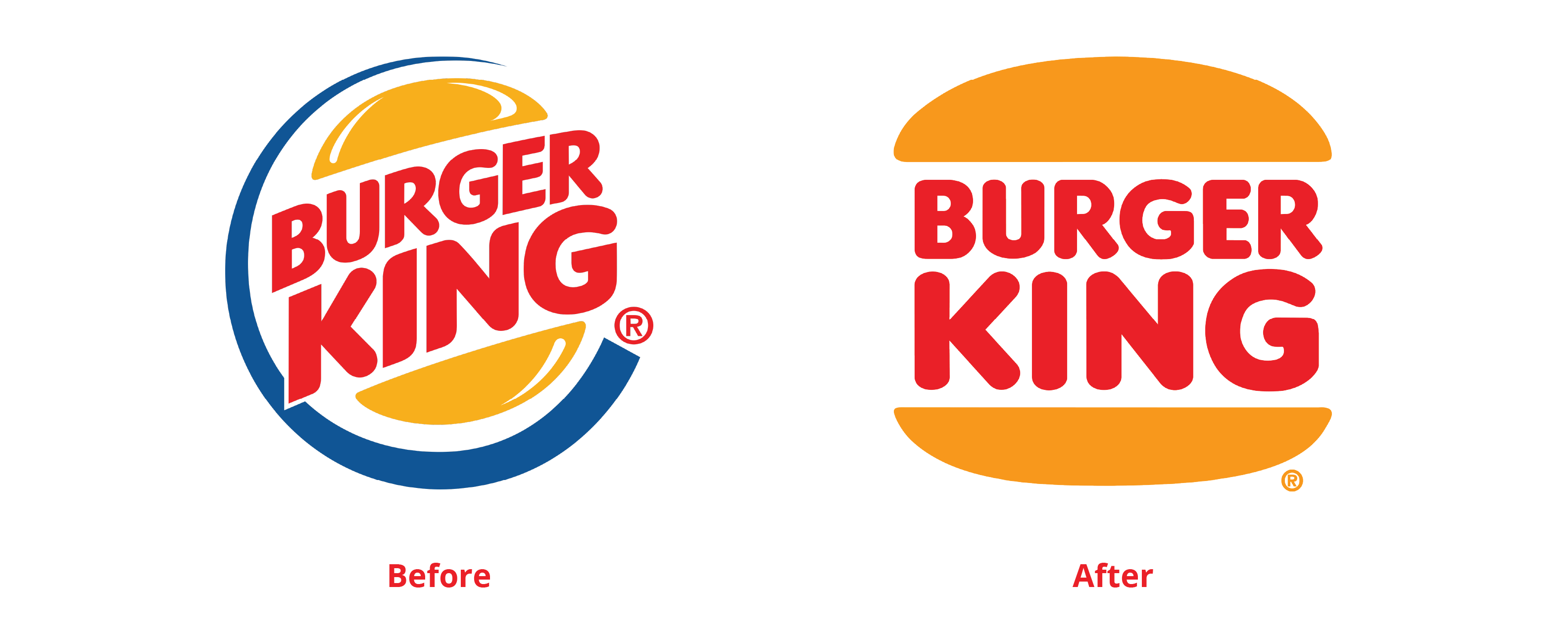
The idea of “minimalism” has become a pervasive trend in contemporary design, from the stripped-down aesthetics of Apple products to the simplified logos of major brands. This trend seems to have led to a loss of detail in design, as designers prioritize simplicity over complexity.
For the majority of the 20th century, design was often characterized by a maximalist aesthetic, with bold colors, flashy patterns, and intricate details. It became associated with a kind of consumerist excess, as companies used design to sell more and more products to consumers in an already saturated market. In contrast, minimalism presents a kind of antidote to this excess. By stripping away unnecessary details and simplifying designs, minimalism offers a kind of purity and simplicity that many find appealing, in addition to the promotion of clarity. However, many modern designers argue that by focusing solely on simplicity, one can risk losing important details and nuances that can make a design truly special.
![]()
Detail is essential to good design (that is subjective, I admit – but let me elaborate). Details can add depth and meaning to a design, giving it a sense of texture and nuance that might be lost in a more minimalistic approach. In some cases, details can even be functional, helping users understand how to interact with, and even remember, a product or interface. Take the Warner Bros logo redesign as an example. From the likes of “Looney Tunes” and “Harry Potter,” people know Warner Bros for its movies that begin with its iconic 3D shield. A survey from Visual Objects, a portfolio website, showed that 89% of the participants preferred the old golden 3D shield over the new flat-looking white and blue logo – even though the latter is less cluttered, easier to recognize and much more cost efficient for print, and much more appealing for merchandising.
89% of people prefer the old Warner Bros. logo (Visual Objects, 2020)
At the same time, it’s worth noting that not all details are created equal. Some details are essential to a design, while others might be distracting. Good designers need to be able to distinguish between these two types of details, and make choices about what to include and what to leave out. For example, in website design, to ensure easy navigation and comprehension, there are some essential details that entail exceptional user experience and functionality such as navigation menu placement, clear call-to-action buttons, and legible text. Distracting details, on the other hand, include excessive animations, complex graphics, or unnecessary decorative elements, which, when overused, can overwhelm users and divert attention from the site’s main message.
Ultimately, the death of detail in design is not necessarily a bad thing, but it does represent a shift in the way we think about design. As designers continue to explore the possibilities of minimalism, they will need to find ways to balance simplicity with richness, and to embrace the power of detail. By doing so, they can create designs that are both elegant and functional, and that speak to the needs and desires of users in a meaningful way.