
You could say, ultimately, the service or product experience matters most to the end user. That’s what builds real trust and loyalty over time. But a strong brand isn’t just about performance—it’s about perception. Visual identity plays a crucial role in getting people to that experience in the first place. Many brands deliver exceptional products and services, yet fail to present themselves in a way that reflects their true value. A brand’s visual identity should communicate its promise clearly and consistently, building trust before a single interaction takes place. As a brand identity designer, I often see a disconnect between how well a brand performs and how poorly it presents itself. That gap can undermine credibility, confuse audiences, and weaken impact.
So, while the service is the foundation, think of brand identity as the invitation.
A Real-World Example
Let me share a personal example to illustrate this. UNiTOW and Clover Towing have both been in business for over 30 years. Based solely on Unitow’s visual identity, a slick, creative combination band name—clean lines, and structured design—it does give the impression of a professional company. From a branding standpoint, the logo appears trustworthy, reliable, and aligned with industry standards. This can influence first impressions positively, especially for decision-makers evaluating vendors at a glance.
However, there are two types of professionalism: visual professionalism and operational professionalism. When we first signed up with UNiTOW, the visual identity gave us confidence that they were professional and capable. That is why we chose it over Clover Towing. But call after call, they failed to show up. Whatever the reason, the result was clear: services were not rendered.
In contrast, Clover Towing consistently delivers fast, reliable service with exceptional professionalism. They understand customer needs, respond promptly, and always follow through. However, their logo feels like a self-designed or early-stage design—likely during the early stages of the business. This is where Clover Towing misses a real opportunity: their brand experience is solid, but their outdated visual identity may deter potential clients.
This is a common situation. Small businesses often start with a DIY logo. Over time, the business grows and improves, but the logo stays the same. This creates a visual disconnect between the outdated identity and the refined service the company now provides.
Constructive Analysis:
Clover Towing’s Current Logo
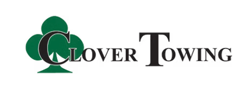
Composition Issues
Placing the font directly over the icon clutters the design.
Colour Contrast
Green and black are both strong colours. When used together with overlapping elements, readability suffers. The letter C on top of the icon not only makes it hard to read but it also pusher the hierarchy to look at the letter T of the second word first.
Outline Band-Aid
A white outline was added to help legibility, but it still doesn’t resolve the issue.
Typography
The initial-cap styling is visually not interesting. It creates cognitive load as it isolates the initials from the words. Another layer of complexity. But what is its purpose? And does it support functionality or aesthetics?
Redesign Proposal: A Stronger Brand Identity
Let’s reimagine Clover Towing’s brand identity to better reflect the quality of their service.
Redesign the Icon
Move toward a more geometric and unique shape—something memorable and scalable.
Choose a Timeless Typeface
Use a font that conveys trust and has stood the test of time. Baskerville Bold was selected for its classic serif structure and authoritative tone, evoking a sense of trust, tradition, and reliability — qualities essential to a brand built on dependable service and professionalism.
Craft a Balanced Composition
Once we’ve established the icon and type, we focus on alignment, spacing, and how the elements interact. The goal is a composition that’s visually pleasing, clear, and adaptable.
Step 1
Step 2
Step 3
Redesigned brand icon
Redesigned brand logo – stack layout
Redesigned brand logo – horizontal layout
Conclusion
When a company’s logo and brand identity match the quality of their service, it builds a cohesive and trustworthy perception. Businesses should invest in branding not just at the beginning, but as they evolve—aligning their visual identity with the standards they’ve worked hard to achieve.
A great logo doesn’t just look good. It builds confidence, opens doors, and supports the customer experience from the very first impression.