A logo is a form of identity. It is the smallest and the most significant visual form to create recognition and ownership of a brand. Some logos have hidden messages or hidden symbolism that are carefully designed. Its discovery becomes often intriguing almost mesmerizing to a point where you never see anything else but that what you have discovered. In this article I will help you see the hidden message in Tesla’s logo. Of course it is an interpretation.
First, I will talk about 3 brand logos (Toblerone, FedEx, and NBC) that create an imagery using the same technique. I think this style is a very artistic approach that is usually carefully designed. There is a hidden message in plain sight that is in the negative space. Think of it as a cut out or a transparent element that often will take the colour of its background. The following use “negative space icon” in their logo.
If you look closer at the mountain. What looks like the snow is in part a bear. Why a bear? Bern (City of Bears) is the Swiss Capital origin of the chocolate factory. Here the logo celebrates its origin. (1000logos.net, 2022)
NBC the National Broadcasting logo design from 1886 illustrates a peacock in the negative space. The form of the space is created by its surrounding filled shapes.
Now let us look at the Tesla brand logo:
At first sight, I always liked the shape of the letter T. It looks futuristic, alienated, like a spaceship. It wasn’t until mind 2021 that the Tesla’s logo really caught my attention. I was curious why Tesla’s logo was designed the way it was designed. I wanted to know if there was a symbolic meaning. The articles that I found were all quoting Elon Musk’s tweet where he said:
“…the T is like a cross section of an electric motor,…” (Twitter, 2017)
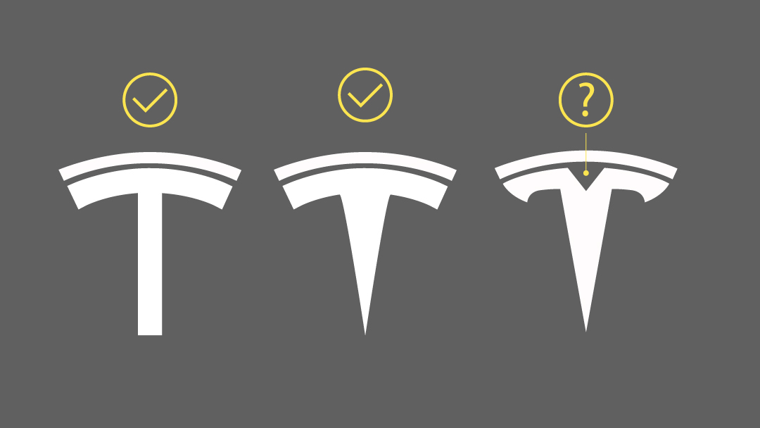
I came across an article from carlogos.org that explains the relationship with the following images.
Image from: carlogos.org
As you can see in the above images the explanation does make kind of sense. But let us look at how it could have transformed into the logo.
I should say that the following is an interpretation. It is not my intention to vilify the brand.
Discovery consists of looking at the same thing as everyone else and thinking something different.
– Roger Von Oech
If you look at everything but the icon itself, if you look at the negative space that is created by the icon, then you should see a human figure ( shoulders, ahead with horns like a bull’s head. Look at the red, not the white.
The horns have certainly many symbolic meanings throughout time and history: I am not sure if there is a reference to the Asterion (meaning Starry one – resembling a star in brightness or shape) from Greek mythology. Or if there is a reference to life and prosperity and belief of the bull skull holding the spirit’s secret knowledge from the Shamans Native Americans. Or if there is a reference to the Horns of Ammon.
(Ammon was often depicted with ram’s horns so as this deity became a symbol of supremacy, kings and emperors came to be depicted with Horns of Ammon on the sides of their heads in profile – Wikipedia, 2022).
Perhaps the figure that emerges from the negative space is a tribute to Nicola Tesla or Elon Musk himself.
Another interpretation could be to view the top portion of the composition as a halo or a sombrero. For this one you have to look at the white and the red.
Maybe RO::Studio did not intentionally mean to incorporate a hidden message. There is always the design that happens by accident. Time will tell. In any event, this is ingenious and a good representation of the brand. What do you think?